The Right Tool For The Job
There are many options out there for formatting a print book—MS Word & Google Docs are two you might already have—but when it comes to handcrafting something as beautiful and as complex as a novel, you’ll want more control. For this, I recommend Adobe InDesign.
Note: If you decide to go with another software, I’m confident the same principles apply!
The Free Options
I don’t use MS Word or Google Docs for final formatting, so I won’t spend much time explaining how they work. Here are just a few basic tips to get you started:
- Make sure all of your titles, chapter titles, headings, and subheadings are all marked as some sort of heading (Title, Subtitle, H1, H2, H3, etc) and that your paragraphs are all set to “paragraph” or “normal text”. This will help the platforms you upload to recognize the formatting (Especially for eBooks).
- For margins and page size you will use File > Page Setup (or similar schema)
- For page numbers and headers you will use Format > Select Option (or similar schema)
- For page breaks (i.e. chapter cutoffs) you will use Insert > Page Break (or similar schema)
The Best Option
Adobe InDesign. It’s $21/month if you only want that program, or $55/month if you want the entire suite of Adobe programs. You can also save a chunk of money if you are a student or teacher. Hit up the Adobe website to see which pricing option applies to you.
The reason I am pushing InDesign is because of its versatility. You can create nearly any size and shape of book that you can imagine. If you have illustrations, they are easy to place and resize. If you want diagonal words in some spots, you just grab the text box and twist. Gonna publish multiple books in a series? You can save a template so they all look the same. If you can think of it, you can probably do it with InDesign. Need I go on?
Learn the Lingo
Here are some basic terms to familiarize yourself with when designing your own book.
Margins – This is the space between the edge of the text and the edge of the page. (Measured in inches in the U.S.)
Gutter – Extra space on the inner margin to account for binding.
Bleed – For any page/cover containing illustrations or graphics, if you want your image/text to go all the way to the edge, you want to add a “buffer zone” called bleed. Your choice of printer will provide you with a document with these measurements.
Spine – This is noted because the spine of your book will have its own set of measurements separate from page size and based on number of pages.
Paragraph Styles – Saved font formats/attributes. You will use a list of these instead of highlighting individual spans of text and setting the font like you would in a typical Word doc.
Character Styles – Similar to Paragraph Styles, these would be use to save an individual character such as a Dropcap.
Master Pages/A-Master – This is the template for all of the pages within your novel. Instead of editing pages individually, you just edit this A-Master.
Properties – This is the editing menu in InDesign where you will find Text Styles, Character Styles, font sizes, spacing, paragraph justification, etc…
Paragraph Justification – We all know what a paragraph is, but in novels you want to “justify” your paragraphs so it lines up nicely on the inside and outside edges.
Dropcap – This is the big first letter at the beginning of a chapter (optional, but worth it for aesthetic.)
Layers, Pages, Links – These are three additional tabs you will want ready in your right-side panel. If they are not visible, you can go to Window > Select Desired Tab > Drag Into Panel
First, The File
From here on out I am going to assume you have plenty of computing experience and at least some Adobe (or similar) software experience. I may go more in depth in a future guide, but the purpose of this guide is to format a novel.
- Open InDesign
- Create a New Print Document (You can also select File > New > Book to create a new book file—i.e. separating chapters as individual files— but I prefer to create a single Doc)
- Choose your page setup. Here are some beginning tips:
- Units > Inches (If in U.S.)
- Width & Height – This is the size of a single page, not the spread. In Part 3 I went over how to decide what size you want your book to be.
- Pages – Guesstimate how many pages total your book will be. You can edit this later under File > Document Setup
- Facing pages – Check this box as it creates your spread (As if the book was laying open in front of you).
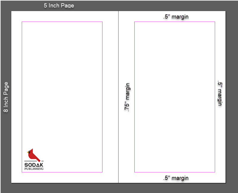
- Margins – Similar to how you chose the size of your book, go back to a favorite book of that same size and literally measure its margins with a tape measurer. Then enter those values in the Top, Bottom, Inside, and Outside boxes. (Don’t worry, you can easily edit these later under Layout > Margins and Columns)
- Gutter – Instead of doing math twice, just increase your inner margin by around .25 inches
4. Your new document setup should look like this, and when click “Create” you should have a spread like the one pictured below!
Adding Text, Images, and Custom Fonts
In InDesign, you will need to get used to adding text boxes. I will give you a super brief crash course below, but please keep in mind that you want to keep each unique section of text in its own box so you can easily drag them without disrupting the rest of the document.
- Adding a text box – This one’s easy! Click on the “T” in the left toolbar and then drag out a box on your blank page. From here you can type out whatever you want inside the box.
- Keyboard shortcut “T“
- Resizing a text box – Click the black arrow in the left toolbar and then drag any of the corners to resize a text box. Pro tip: You can double click one of the edit points to instantly fit the box to the current text.
- Keyboard shortcut “V“
- Adding an image – Similar to the text box, you will click on the box with an “x” through it in the left toolbar (Frame Tool) and then drag out a frame on your page. With that new frame selected, you can go to File > Place and then select the image you want to fill that frame.
- Keyboard shortcut “F“
- Resizing an image – Uh oh! Is the image way too big/small for the box you created? No problem! Use the black arrow (V) to select either the frame or the image inside. From there you’ll get edit points to resize either of them.
- Changing your font – Since you will not be creating text styles quite yet, you can change the fonts/text size via the properties window. If this is not yet in your right-side toolbar, add it via Window > Properties.
- Adding a custom font – If you want to use a custom font, first make sure that it is a font that is royalty free or that you’ve purchased the rights. If so, go ahead and install that font as you would any other on your computer. InDesign will recognize it automatically!
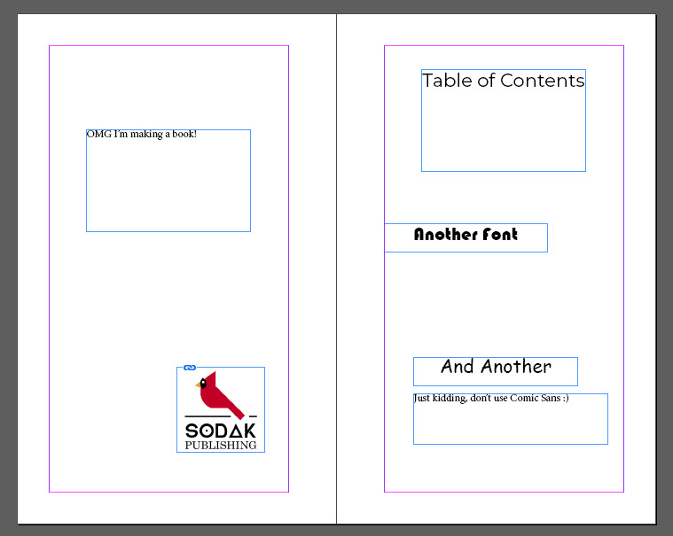
Next Up: Title Page, Table of Contents, Copyright, & Dedication
For the most part, I urge you to look through many of your favorite books and then duplicate the elements you like the most. Chances are, you’ve been thinking about these few sections long before you even finished your final daft. I get it, it’s exciting! And it’s where you start making your book feel like…well…you!
Title Page
Typically, you will leave one blank spread and then add the title page on the right page of the following spread. If you have previously published works, list them opposite the title page. Your title page should include the title of the book, the author’s name, a subtitle if you have one, and an imprint if you have one (which you should if you completed Part 6!)
Copyright
Next page is copyright. This should include:
- Work of fiction proclamation (If fiction)
- Copyright date
- All rights reserved
- Publisher
- ISBNs of ALL editions
- Art design credits
- Your socials (If you’d like)
- Book edition (Likely first edition if you’re following this guide!)
Again, duplicate elements of other copyright pages that speak to you.
Dedication
Opposite Copyright Page. Usually blank with your personal dedication.
“I dedicate this guide to all self publishers”
Table of Contents
If you grew up reading books, you already know exactly what this is. My only recommendation is to have fun with it!
Now, The Manuscript
This is the big moment…Your words are finally going in a book! From my experience there are two ways I like to tackle this:
- The first way to start is to create a text box (T) that fills up the entire outlined page within the margin. Copy the first chapter of your Manuscript Master doc (from Part 1) and paste it in said box. If the chapter is more than one page, which it likely is, don’t worry! There will be red “+” sign on the lower right of the text box. Click that and then hover over to the next page. Hold “Shift“, then left click to add the rest of the pages of this section automatically! (See this video for more in-depth instructions)
- If you don’t have specific chapters or are using a free-flowing “section” style, copy/paste the manuscript entirely into one text box and then format as you go. For examples of this, see “The Road” by Cormac McCarthy or “Man, Kind” by me. 😊
Time For Style(s)
 Since InDesign allows so much customization, and you are formatting this all by yourself, you want to minimize the chances of having one section of your book look wildly different from another section. To mitigate these risks, we use Paragraph Styles and Character Styles. This is probably the most complicated part of the InDesign guide, but trust me, getting your styles ready to go will save you a ton of time and headache in the long run.
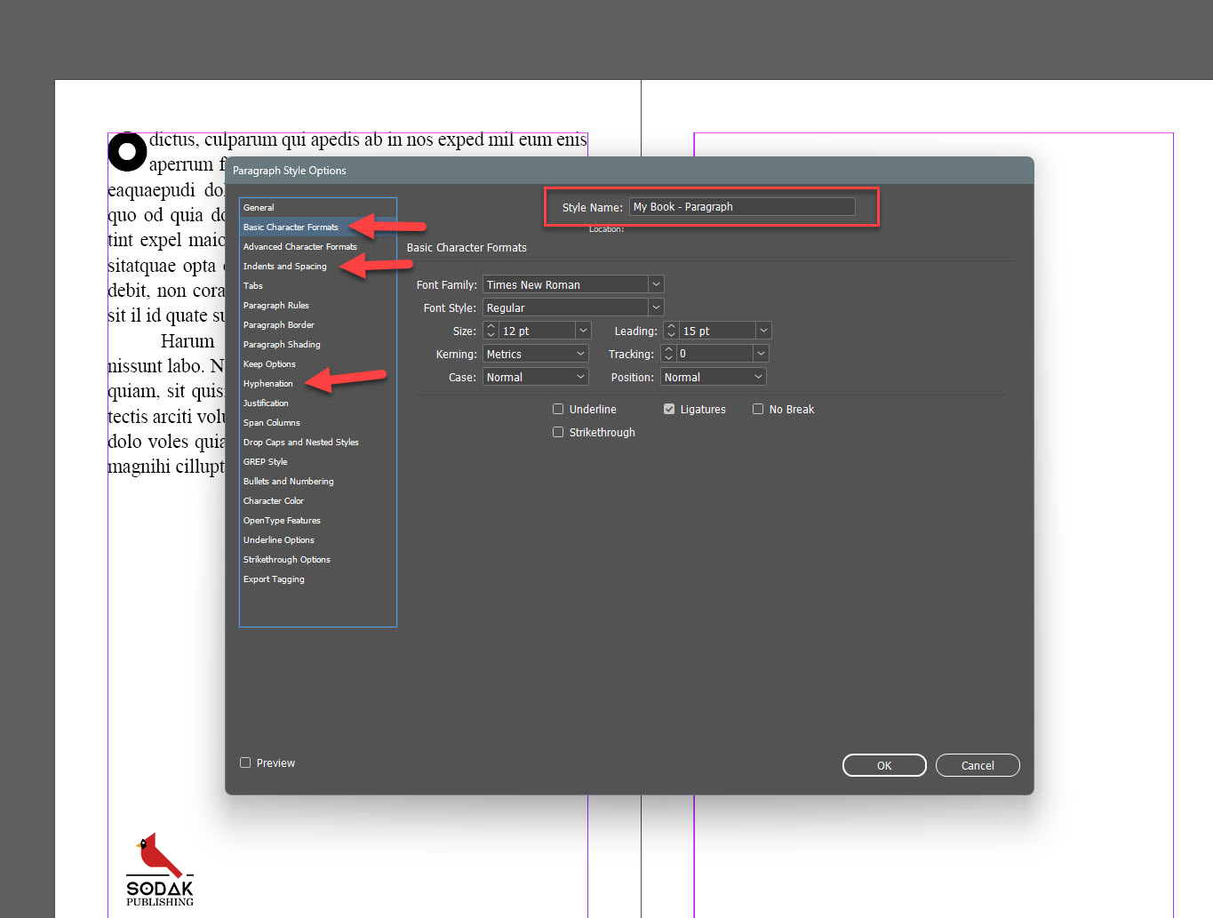
First up, let’s make two Paragraph Styles. You’ve already copied and pasted your text into a text box. Let’s highlight two paragraphs of that text and select “New Paragraph Style” by clicking the little “+” sign under the text styles window. Now you’ll be met with all of the settings marked by tabs on the left side.
 For a test run of how your paragraphs will look, let’s use:
- General > Style Name – “My Book – Paragraph”
- Basic Character Formats:
- Font – Times New Roman
- Font Size – 12 (11 – 12 is a typical font size for books 5×8 and larger)
- Leading – 15 (This is the space between lines. More space = easier to read. My rule of thumb is at least 3 points higher than your font size)
- Indents and Spacing
- Paragraph – Justify Left (Always)
- Margins – Leave at 0
- First Line Indent – Around .5 inches
- Hyphenation – We’ll come back to this but for now leave it checked or unchecked, depending on your preference.
To save your style, “OK” at the bottom of the window. Now you can highlight any amount of your text and select “My Book – Paragraph” and it will adopt these settings!
*Note: These same exact principles apply to “Character Styles”. These will be used to change the font/size/spacing of a single character—Think drop caps, page numbers, unique glyphs, etc.
Next, let’s repeat those steps, but for the text regarding the first letter and first paragraph of each chapter. It makes sense to knock these two out at once because they will both be combined in their own, you guessed it, paragraph style! Now someone a long time ago decided the first paragraph of a chapter should not have an indent and we are gonna honor that. But let’s say you want to add that super big first letter—called a Drop Cap—as well. Here’s how I do it.
 First, duplicate or create a new paragraph style and call it something like “My Book – First Paragraph”. Then, we will set it up exactly like our normal paragraphs, except with no line indent.
Now we want to add our drop cap. Under the “Drop Caps and Nested Styles” tab we can select how many letters we want dropped and how many lines we want them to drop. Typically this is only 1 letter and 2 or 3 lines.
But what if we want our drop cap be a different font from the rest of the paragraph? Easy! All we need to do is create a character style first—call it “Drop Cap”—that is its own unique font, then select that character style in the previously mentioned “Drop Caps and Nested Styles” tab. If the spacing looks off for some reason, you may need to fiddle with your character style until you get it just right.
Finally, the best part of using Styles. Let’s say on day 3 of formatting you decide you want to make a change to the font, size, or spacing of your various text styles. No need to go highlight all of that text again! You can just go to the Properties Window, hover over the style you want to edit, then click the pencil icon. A new window will open up and you can change your entire book with the click of a button. Neato!
Some Advanced Styling Tips
With the above guide, some critical thinking, and a creative eye, I believe you will have nailed down your novel in an acceptable format. But you don’t want acceptable, right? You want the ol’ razzle dazzle! Below are a few advanced styling techniques that I will briefly go over with an attached image to help make your book that special something.
Master Pages
 When you set up your a document in InDesign, the program automatically makes you a Master Page called an A-Master by default. You can find this in the right panel under the Pages tab (Or Window > Pages). While looking at the Pages panel, you will see all of your interior pages have little “A’s” on them, meaning they have adopted the style of the A-Master. If you want to edit all of these pages at once, you can just double-click on the blank A-Master at the top of this panel and make your changes from there. (Helpful for editing margins and headings which I will get to below).
Margins
Margins can be the most annoying part of designing your book. You want enough space on the outside so it fits thumbs, enough on the inside so the text doesn’t drip into the spine, and the fewest amount of pages so it doesn’t cost you an arm and a leg to print. And did I mention minimizing how many single lines flop onto the top of a blank page? That’s the worst!
Well I’m here to say, “Don’t stress!” You can edit or change your page margins at any time. Make sure you select the Master Pages in your Pages tab, then click on Layout > Margins & Columns in the main menu. You will get a window similar to when you created the document that allows you to change any margins.
*Pro Tip – If you have some problematic words/sentences that plop onto a blank page, you may need to adjust individual line spacing, the amount of blank space between a Chapter Title and the beginning of the text, how much hyphenating you allow, or even a re-work of font size/spacing. Just fiddle with it, you’ll get there!
Hyphens
This one is for the nitty-gritty Type-A people, but worth noting. In the properties panel, you can simply check “Hyphenate” on or off and InDesign will do its best to to automatically hyphenate words. This is just fine 95% of the time, but just in case you’re like me, you can adjust the exact amount of hyphenating you’ll allow by selecting Text Style >Edit > Hyphenating.
Heading & Page Numbers
You’ve probably noticed that every novel you written has some sort of heading and page number on every page. While it’s up to you on what you want displayed here—Author name, book title, chapter title—it is important to have because it not only gives your reader some subtle brand recognition, it also validates you as a professional. It’s also super easy to do!
Header/Footer: Select the A-Master pages on the Pages tab. Add a text box at the top or bottom of your margins with your desired information. Then center and style it the way you want. Now scroll down through the rest of your book and you’ll notice it now displays on every page. Boom, done!
Page Numbers: Go back to your A-Master page, add a new text box—this time centered opposite your header/footer or to the right or left of it—then select Type > Insert Special Character > Markers > Current Page Number. Now let’s say you don’t want page #1 to start on your title page, but where your actual first chapter starts, just follow this tutorial for the easiest way to change that!
Italics
Some authors like to italicize individual words or dialogue to show their inflection to the reader. I do this, but am trying to cut back since I believe the reader is smart and it is often unnecessary. However, there are often long sections of text that need to be italicized since they regard a flashback or a dream or however the author has creatively decided to use the style. Unfortunately, the best way I have found to replicate this in InDesign is to make a character style, name it “Italics”, and then scan through your whole book to re-apply the italics. I recommend having your Master Manuscript side-by-side with InDesign and just going page by page. This actually does not take as long as you might think since our brains are wired to spot differences quickly!
Cut! Print It!
Holy moly, you did it! You wrote a book AND designed it. You’ve learned so many skills in so little time! I recommend sleeping on this finished product for a couple days and then giving it the ol’ “once over” again, but breathe a huge sigh of relief. The finish line is near! Next up is the eBook, which is largely the same as this tutorial, then it’s off to the races. See you there!